Creating Allstate's First Design System:
A Research-Driven Approach
1+ Years
Multiple Ship Dates
The Allstate Design System project aimed to unify the digital presence
and enhance user experiences across Allstate's web, desktop, tablet, and mobile platforms.
The project involved creating a design system to ensure consistency, maintain Allstate’s online brand image, improve speed-to-market, and maintain high-quality design and accessibility standards across the organization.
The problem
As Design Lead and researcher supporting Allstate's $120 million transformation of agent-facing applications, I identified critical inefficiencies through systematic observation of 12 paired designer teams.
My research revealed duplication of efforts, leading to increased design and development time and hindering the platform modernization goals.
The Solution
This discovery necessitated the creation of Allstate's first comprehensive Pattern and Component Libraries. As a result of the research and stakeholder collaboration, we created a Design System that achieved:
Consistency: Reduced design-related defects by 25% and accelerated the time-to-market for new features by 20%.
Efficiency: Increased development efficiency by 30%
Quality: Achieved a 40% reduction in deployment-related issues
Research
Research Goals
We wanted to understand our users and concurrently define the design system as a product.
Define user needs and expectations for the design system.
Identify key components and design patterns to include in the system.
Determine the best practices for documentation, versioning, and distribution.
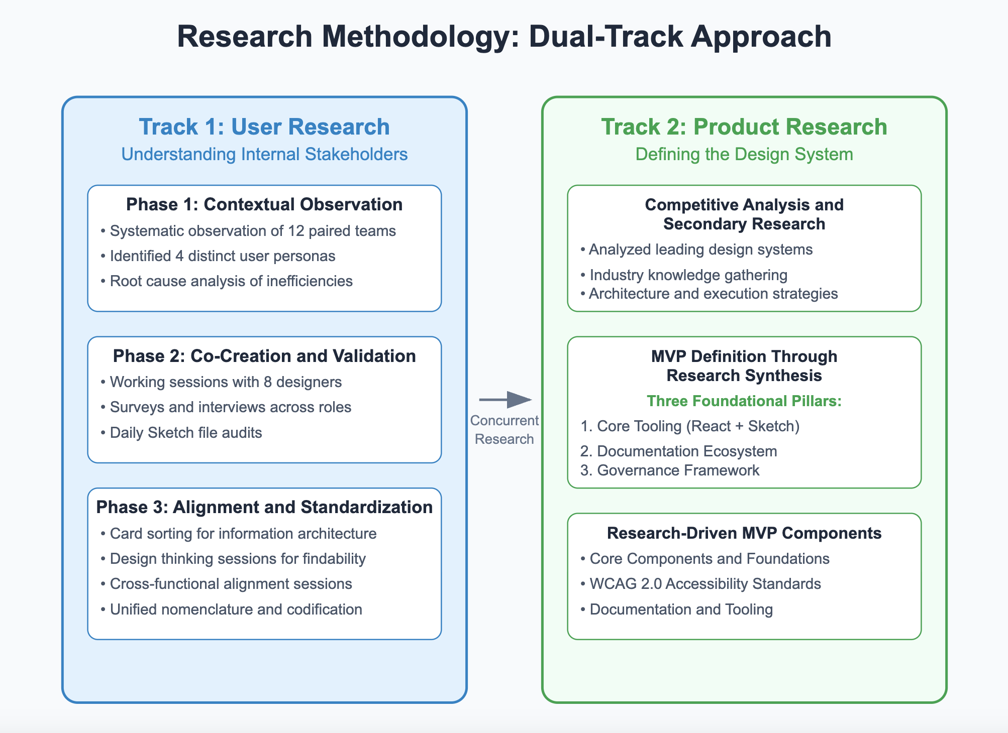
Track 1: Contextual Observation
& Discovery
Conducted two rounds of stakeholder interviews with 7-8 participants to perform root cause analysis of inefficiencies and identify common pain points, and user surveys for all stakeholder groups to gather insights into workflows, needs, and system expectations.
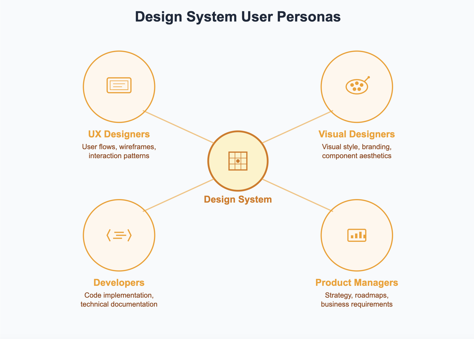
We identified distinct user personas within our program ecosystem: UX designers, visual designers, developers, and product managers, each with unique needs and workflows.
Track 2: Product Research & MVP Definition
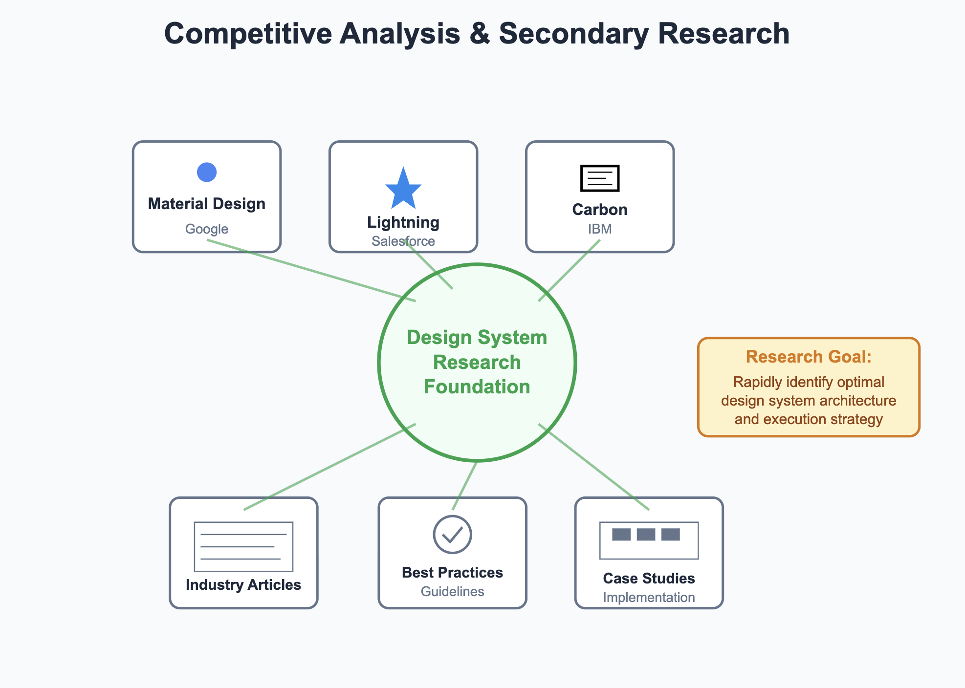
Competitive Analysis & Secondary Research
Analyzed leading design systems to understand structure and implementation approaches
Conducted extensive secondary research through articles and industry knowledge gathering
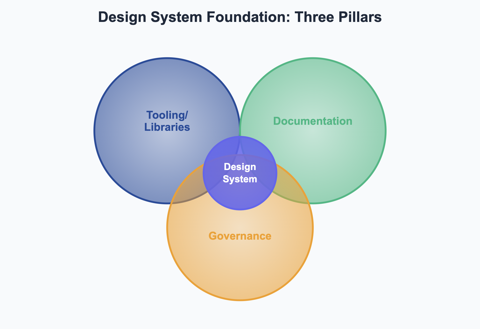
Based on primary user research and secondary research, we identified three foundational pillars:
Core Tooling: React Component Library + Sketch Pattern Library
Documentation Ecosystem: Guidelines for designers, developers, including content and accessibility
Governance Framework: Contribution models, communication channels (Slack), and onboarding processes
Key Research Findings
Designers required a centralized repository for design components, guidelines, and documentation.
Developers needed a code focused documentation solution that provided guidance on using the interface components.
Consistency in naming conventions and component usage rules was crucial.
Efficient distribution methods were needed to ensure easy access to the design system across the enterprise.
Based on the research findings, the following objectives were defined:
Develop a comprehensive design system that includes a Sketch symbols library, React.js component library, accessible via Node Package Manager.
Ensure the design system solutions were well-documented and easily accessible to all designers and developers.
Implement CI/CD pipelines for automated integration testing and deployment to maintain quality and compliance.
Core MVP Features
Based on research synthesis from both user needs and competitive analysis, we defined a focused MVP that prioritized essential functionality over advanced features.
MVP Components:
Core UI Components: Buttons, forms, data tables etc.
Design Foundations: Color palettes, typography, centralized icons, grid systems
Tooling: React Component Library and Sketch Pattern Library
Documentation: Design, development, and content guidelines
Accessibility Standards: WCAG 2.0 compliance and contrast testing
Basic Governance: Support channels, contribution models, onboarding processes
Advanced features like animations and complex interactions were intentionally deferred to focus on core system stability.
Implementation & Execution
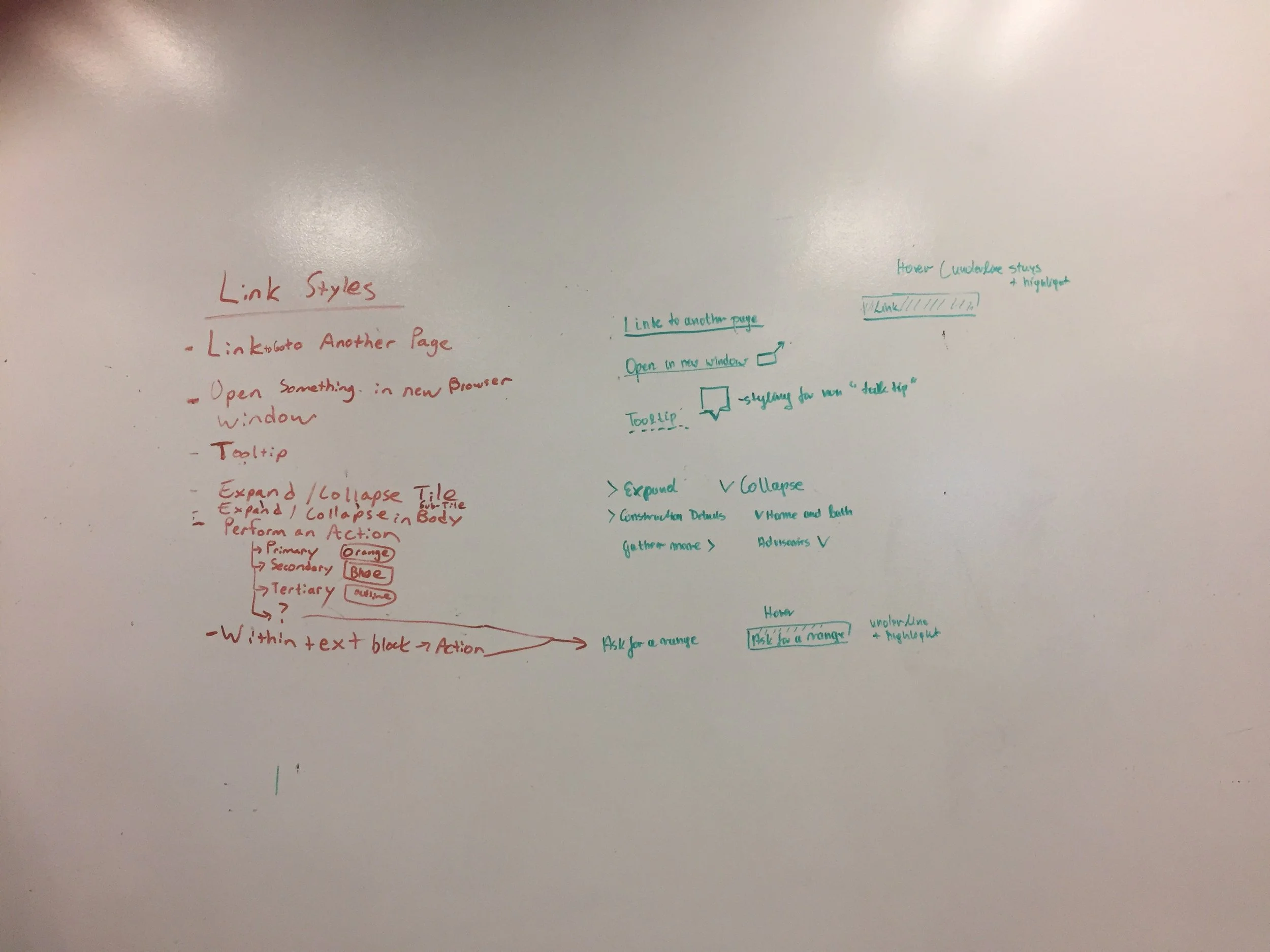
Collaborative Pattern Development
Launched immediate working sessions with ~8 product designers to co-design common patterns they were already developing
Conducted usability testing of new patterns within specific product flows
Stress tested patterns across devices/browsers, high-volume data scenarios, and edge-case content (maximum character limits, messy real user data) to ensure reliability
Alignment & Standardization
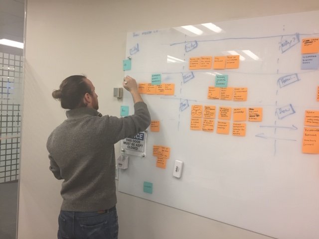
Conducted audits of product-specific Sketch files to identify naming patterns and inconsistencies
Conducted card sorting sessions with users to establish IA, categorization and navigation structure for both design and development libraries
Conducted alignment sessions between designers and developers to establish shared design language
Accessibility Integration
Built WCAG 2.0 guidelines into pattern definition from the start
Conducted color contrast testing using Sketch plugins
Tested with screen readers, keyboard navigation, and high contrast modes to ensure components were functional when color was removed or changed
Embedded WCAG compliance testing in both design and development processes
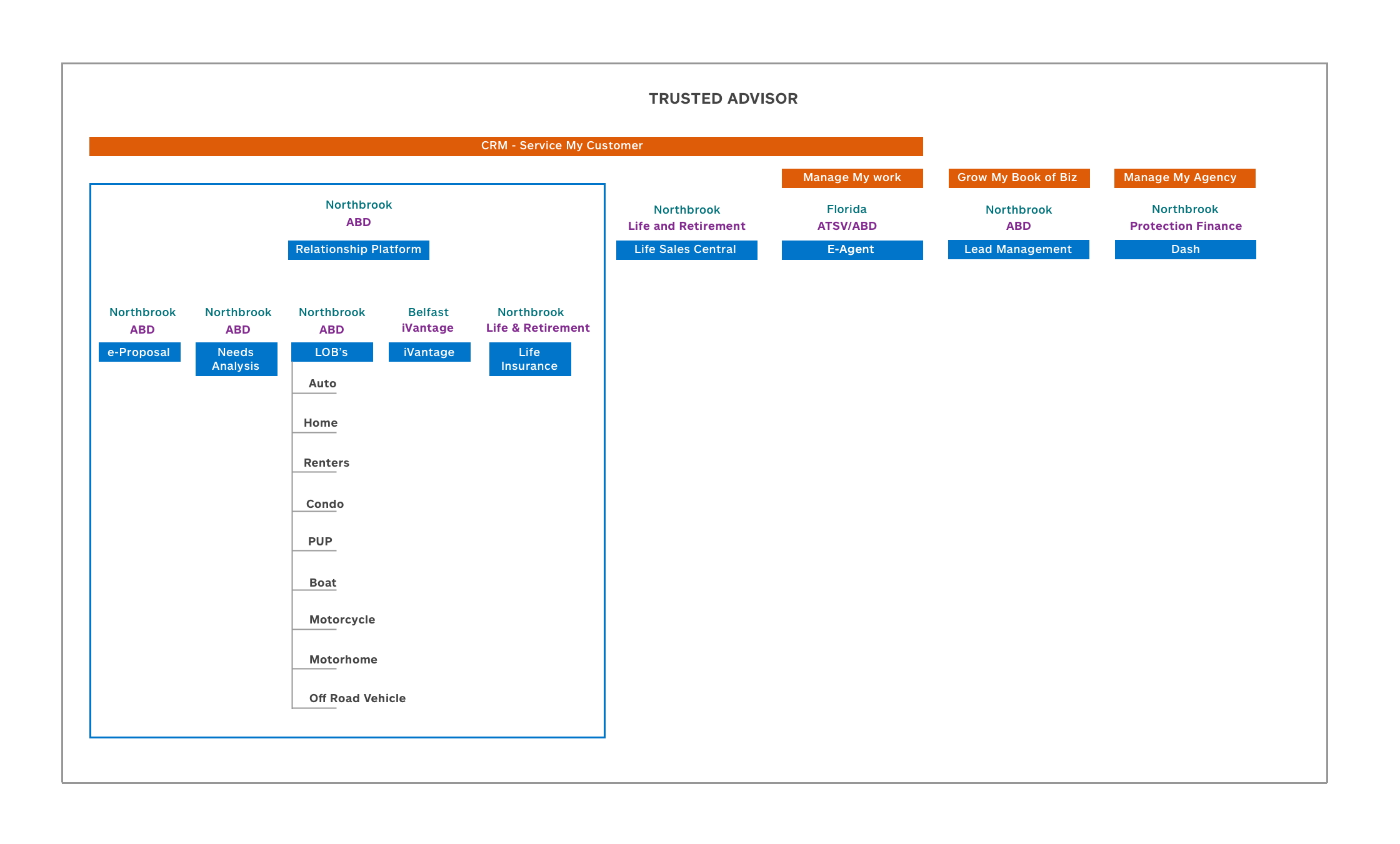
Wireframes & Structure:
We created wireframes to prototype the layout and structure of the design system, focusing on an intuitive interface for accessing components, guidelines, and documentation.
Centralized Foundational Elements:
We consolidated existing grid systems, colors, and branding while I created patterns in Sketch and developed design/content usage guidelines.
Component Development & Testing:
My tech counterpart developed React components and established a GitHub repository while we conducted usability testing to validate each pattern before including it in the library.
Governance & Adoption
We ensured the design system remained user-centered and responsive to evolving organizational needs while maintaining quality standards.
Framework & Support
Established clear contribution guidelines and standards for accessibility, color, forms, and payment modal components
Created dedicated Slack channels for design and development support
Implemented regular office hours, department-wide presentations, and onboarding processes for new teams
Built feedback loops to continuously improve the system based on user needs
Iterative documentation creation
Responding to evolving organizational needs, we iteratively developed targeted documentation - for example, creating gap analysis guides for vendor partners like Infosys and detailed implementation resources for product teams
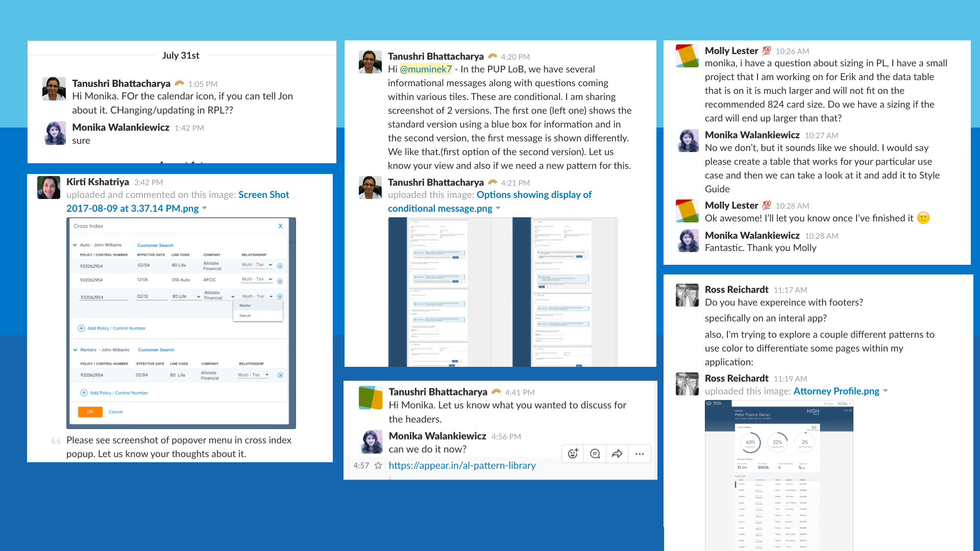
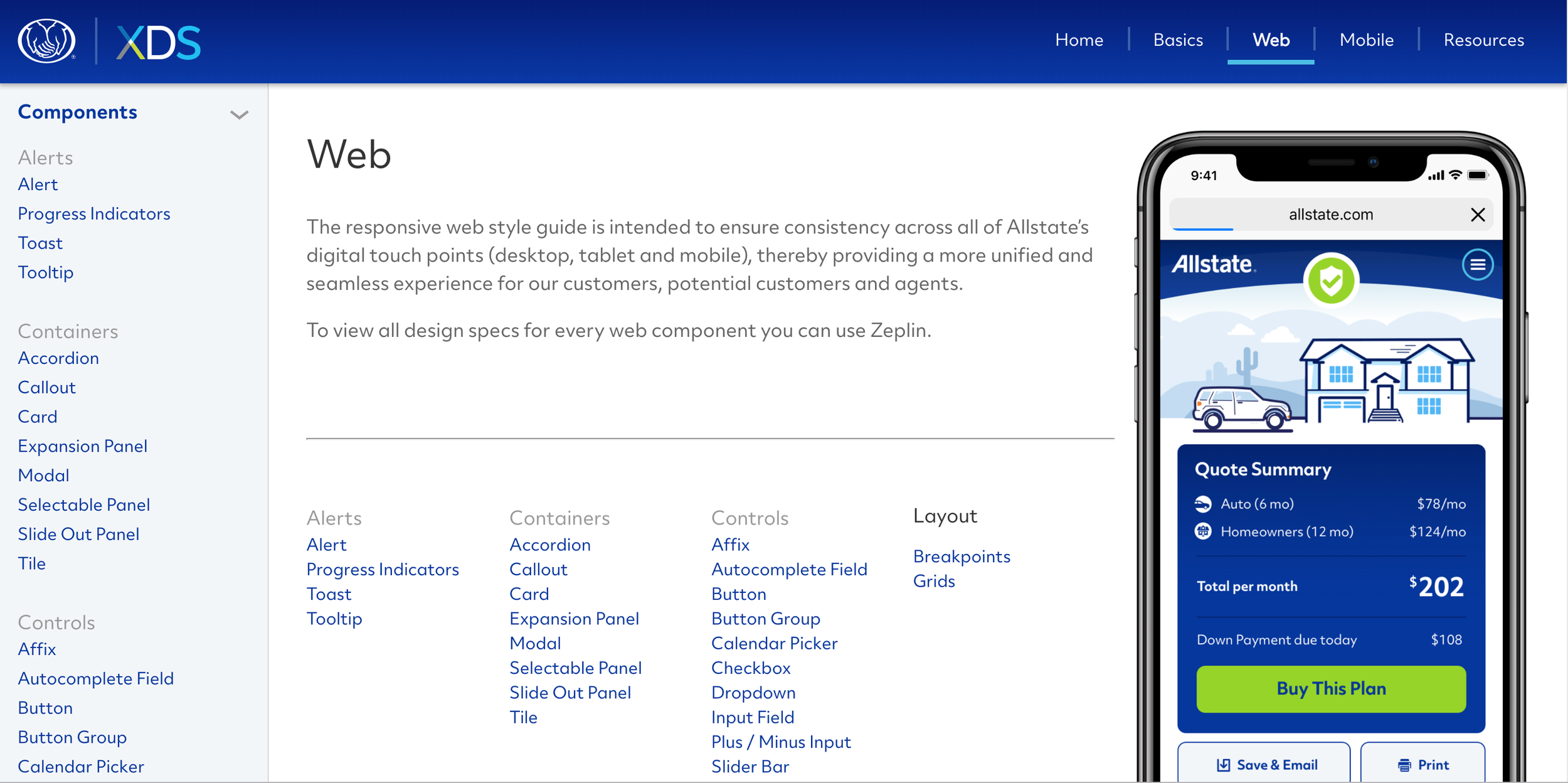
Screenshot from one of the two Slack Channels
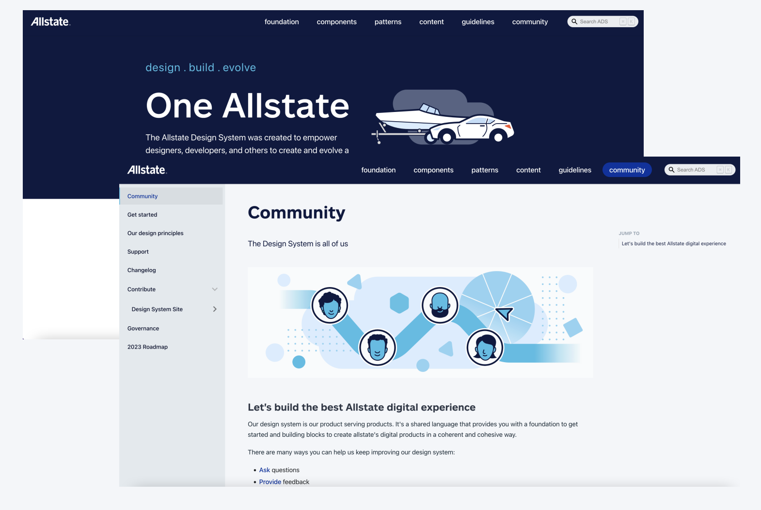
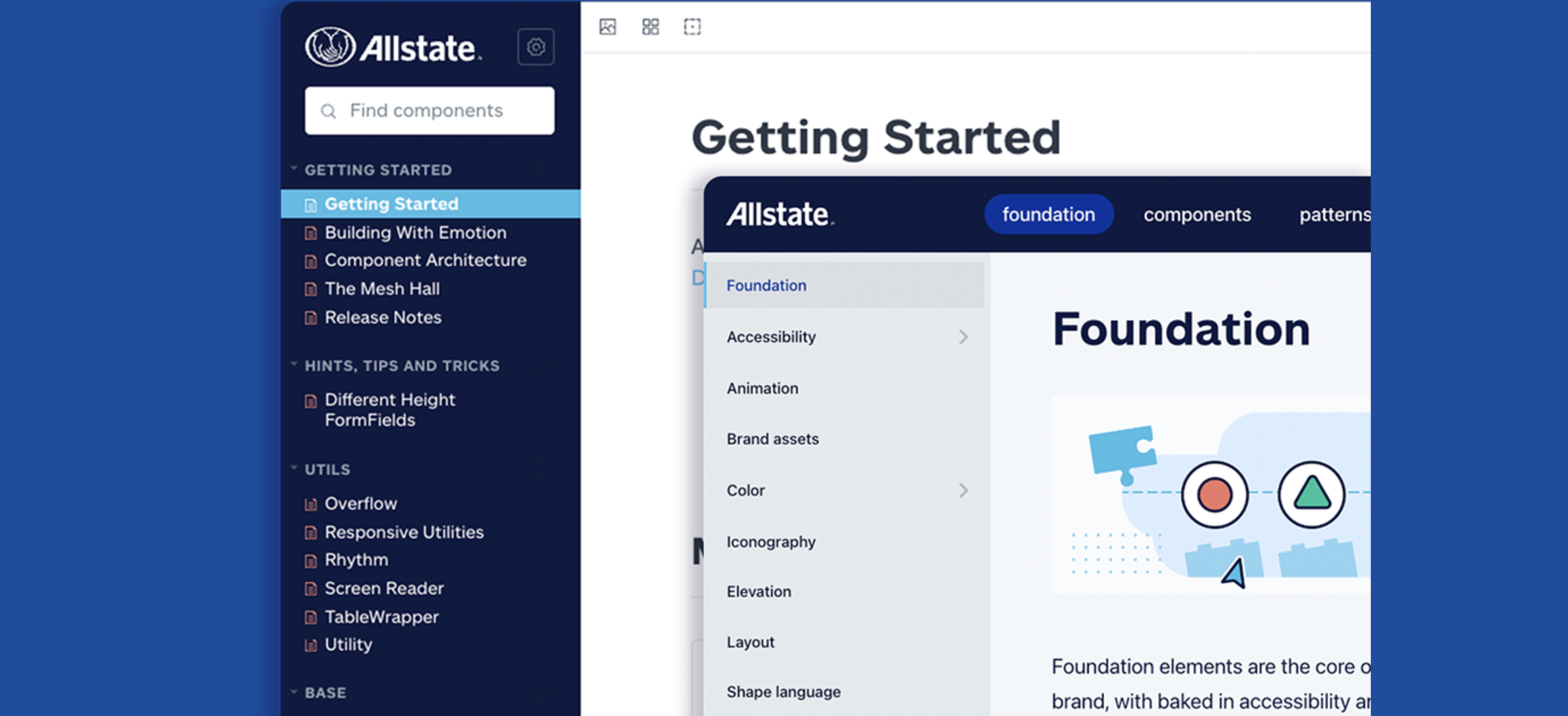
Deliverables
This process resulted in comprehensive pattern documentation including accessibility guidelines, color standards, forms, and payment modals [link to full examples]"
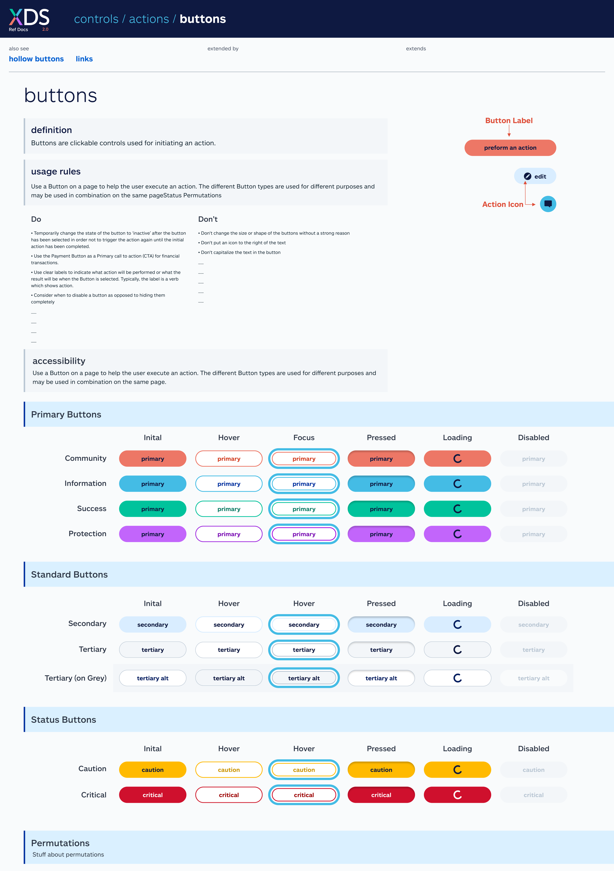
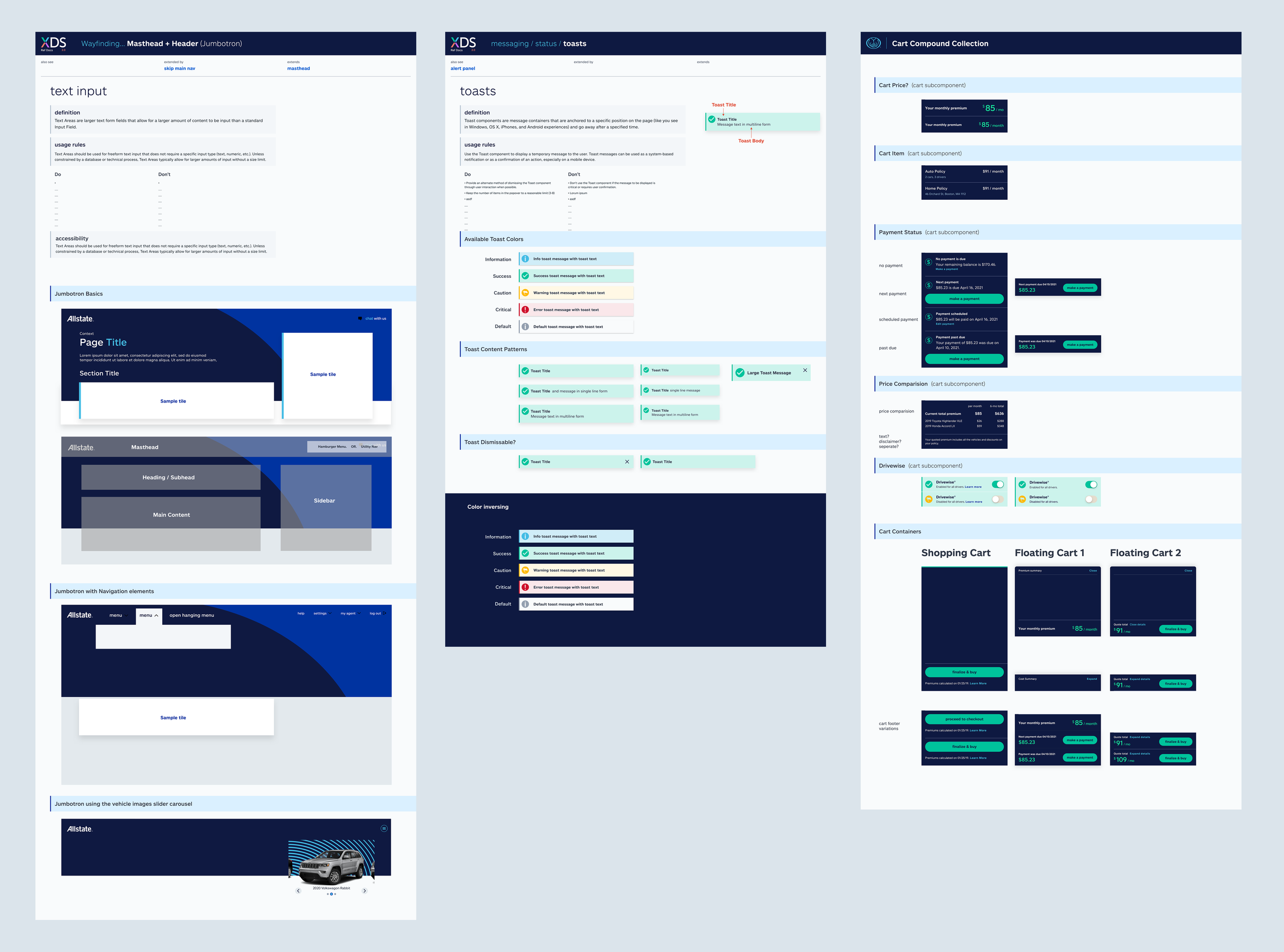
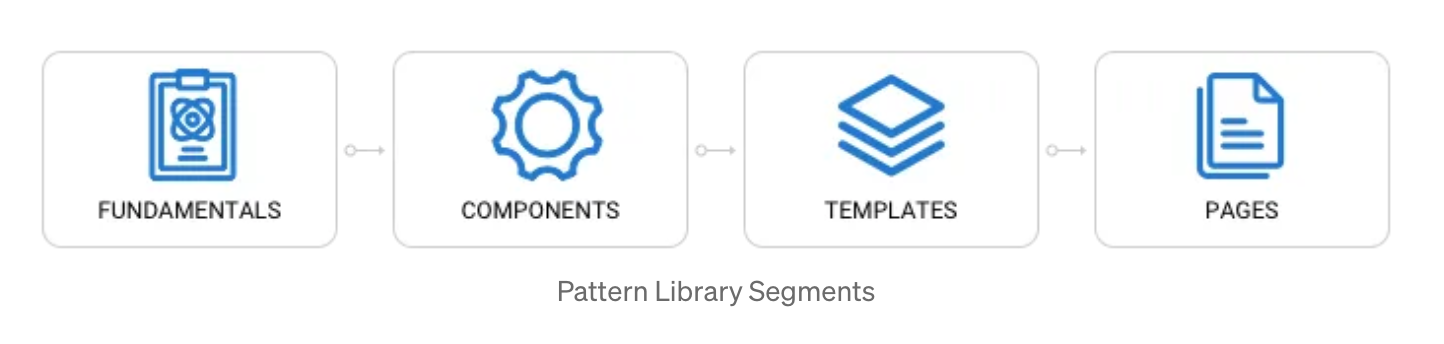
Allstate Design System Pattern Examples
Impact & Evolution
Initially built for B2B agent-facing applications, the design system successfully expanded to integrate consumer-facing products, requiring research to unify disparate design patterns across different user contexts.
The system scaled to 40+ teams within the first year and over 8+ years evolved to serve nearly 100 products across the enterprise, establishing a scalable foundation that continues to accelerate speed-to-market and ensure consistent user experiences throughout Allstate's digital ecosystem.
Key Outcomes:
Increased development efficiency by 30% and reduced design-related defects by 25%
Accelerated time-to-market for new features by 20%
Achieved 40% reduction in deployment-related issues
Successfully scaled from initial B2B focus to enterprise-wide adoption across ~100 products